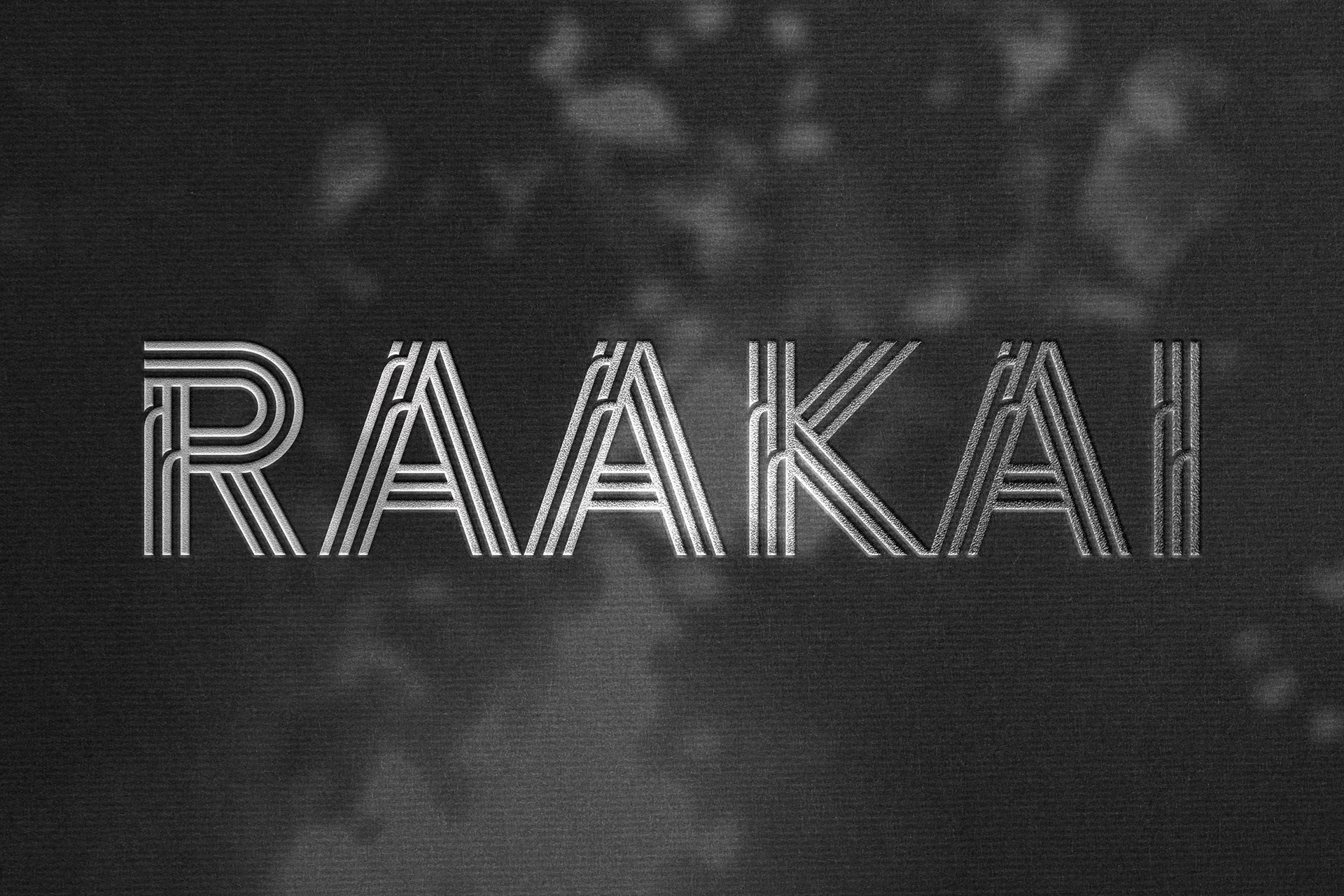
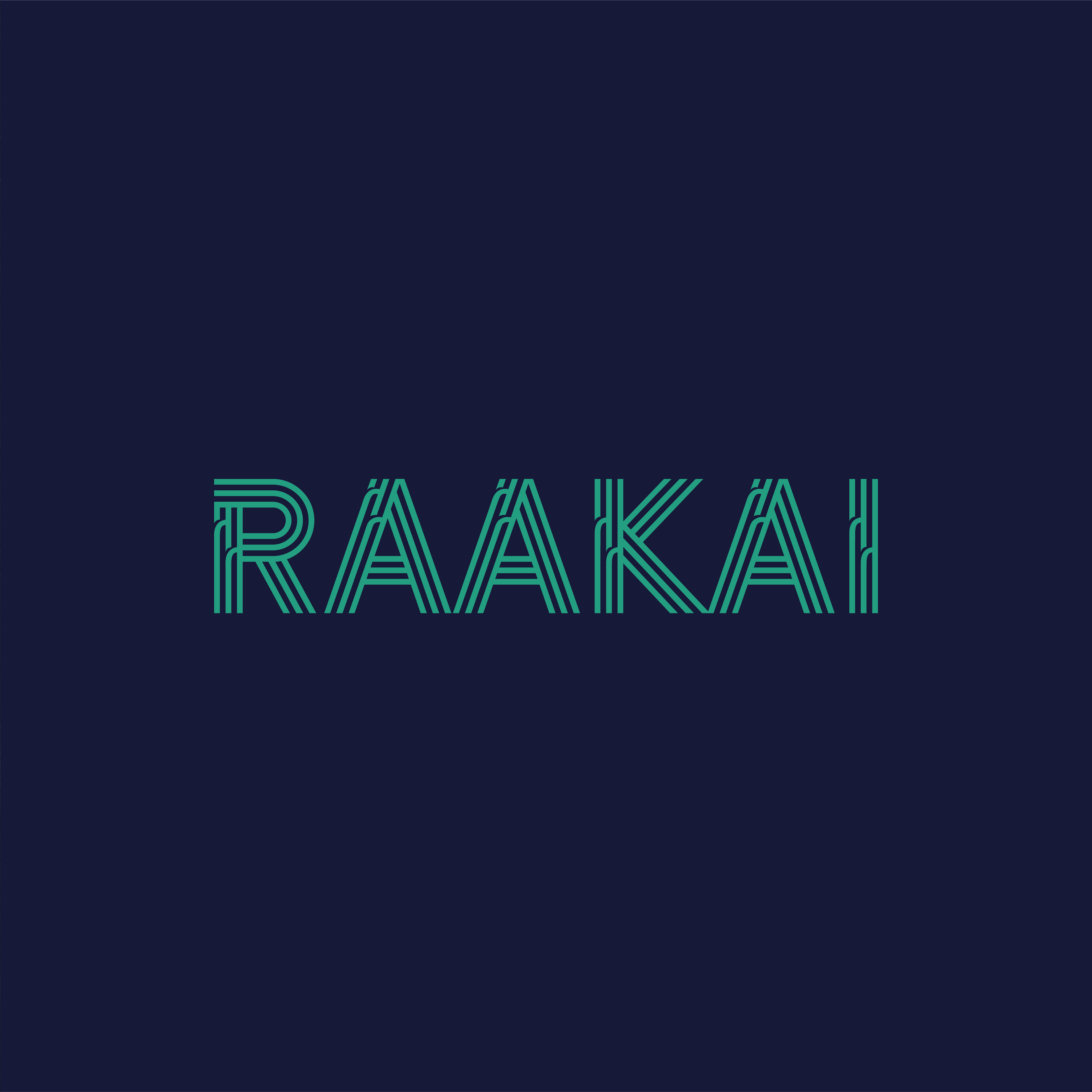
Introducing the logo concept for Raakai.
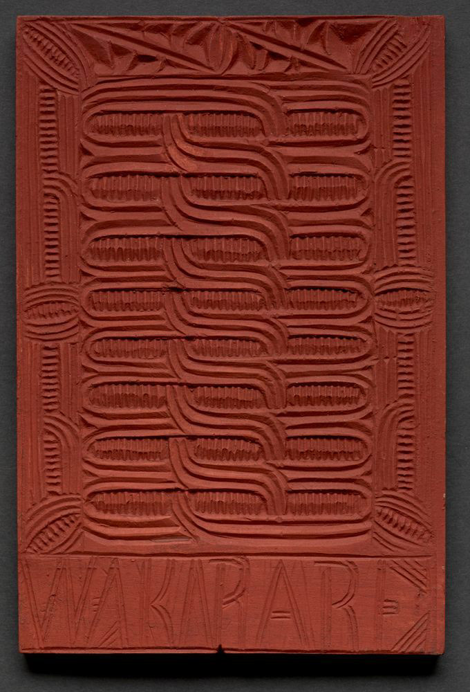
A research kaupapa dedicated to increasing immunisation rates for under 5s in Waikato, supporting healthier futures for our tamariki. In collaboration with Te Rau Ora. The brief was to design a wordmark for Raakai, incorporating an edited font with a distinctive design element. The brand was to reflect a Waikato / Tainui Waka aesthetic and connect to its kaupapa of increasing immunisation rates for under 5s. Additionally, develop a brand pattern to compliment the identity.
The whakarare pattern symbolises growth and connection. The custom typography reflects tradition and flow, reinforcing community and health themes.

Mahi for Taputapu Toi.